
KinAya
Brand Identity
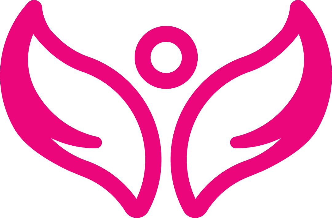
A full brand identity built from the ground up: logomark, logotype, colour system and guidelines, balancing warmth with the trust an NDIS audience needs.
Logo Development


Colour Palette
Final Identity


Website
Six-page Framer site, built for handover. CMS collections drive the repeating content (services, team, posts) so the KinAya team can publish without touching code. Built accessibility-first, with a custom site-wide text resizer that persists across sessions, alongside semantic HTML, focus states, and contrast tuned to the brand palette. SEO basics in place from launch: per-page metadata, Open Graph, clean URLs.
kinaya.com.au ↗Finbar was great to work with from start to finish. He took the time to understand what KinAya needed, communicated clearly throughout, and delivered something that felt cohesive. The branding and website genuinely felt like one vision. The accessibility features he suggested, like the text resizer, showed he was thinking beyond just aesthetics. Handover was smooth and we felt confident managing the site ourselves after his walkthrough. Highly recommend.Aryan Sareen, KinAya
What was delivered
- Six-page Framer website
- Logotype design and kerning
- Auto-advancing hero slideshow
- Shared nav and footer components
- Logomark refinement and development
- Full primary logo (logomark + logotype)
- Custom hover-interactive services component
- All logo deliverables in brand colours, black, and white
- Brand colour system including extended tint and gradient direction
- CMS connected to homes, services, and team sections with detail pages
- FAQ accordion
- Post-launch support
- CMS handover session
- Multiple contact forms
- Mobile-optimised throughout
- Domain connection via GoDaddy
- Foundational SEO and technical setup
- Midjourney image generation with custom style profile
- Gradient map and grain post-processing on all images
- Site-wide text resizer (custom AI-assisted component)
ROLE
Sole designer and developer. Delivered the brand (logomark, logotype, colour, guidelines) and the Framer site itself, including CMS, custom interactive components, and a site-wide accessibility text-resizer.
PROBLEM
KinAya was rebranding from the ground up: new name, new identity. The brand had to feel trustworthy and human without slipping into something flashy. The site needed to be easy for the team to run themselves after launch.
OUTCOME
Brand and site delivered as a single piece of work. CMS handover went smoothly. Positive testimonial from Aryan Sareen.
SKILLS
LINKS
OPEN FOR WORK
finbar@finbar.studio