Compass Capability
The mark and the system
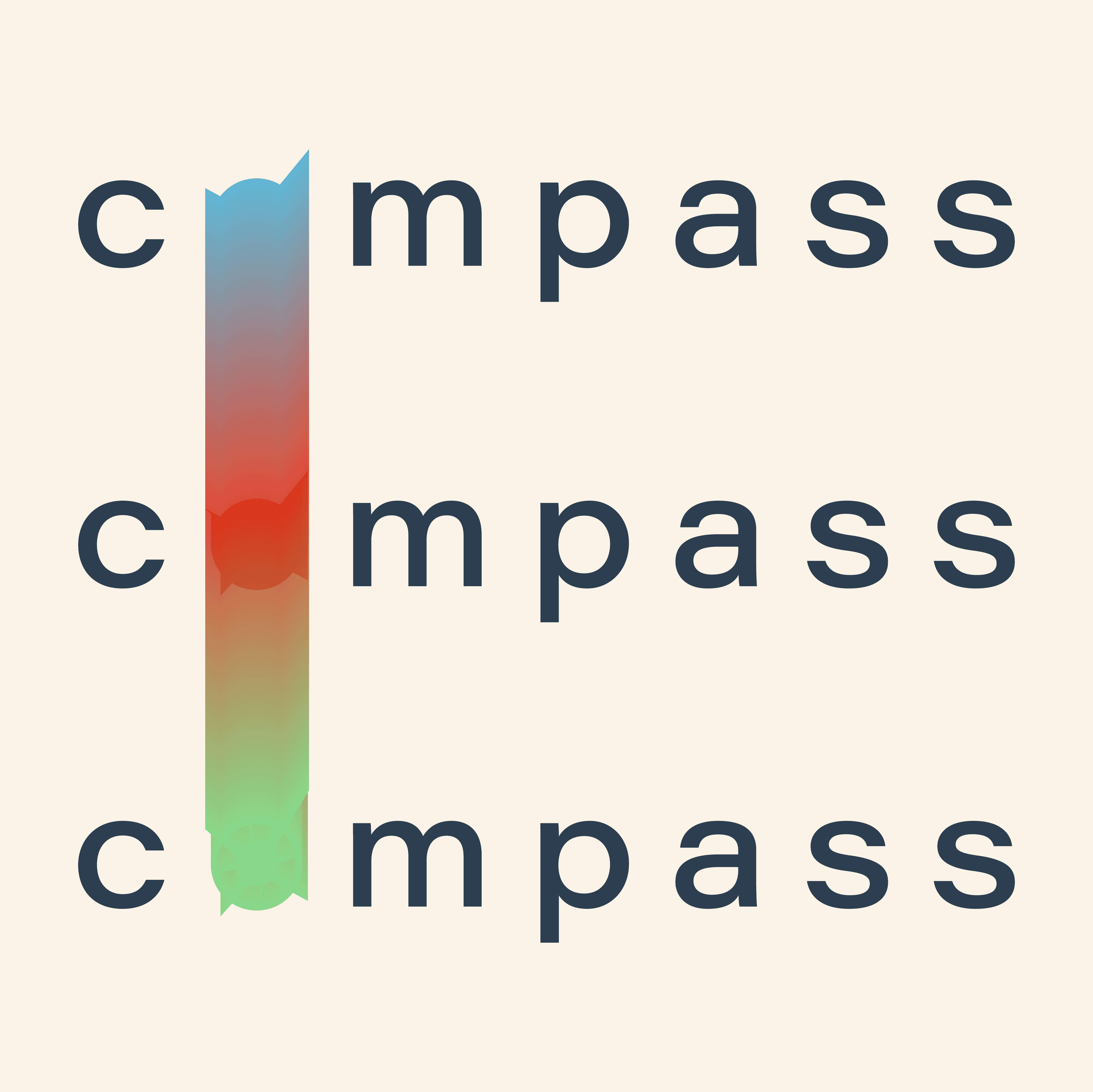
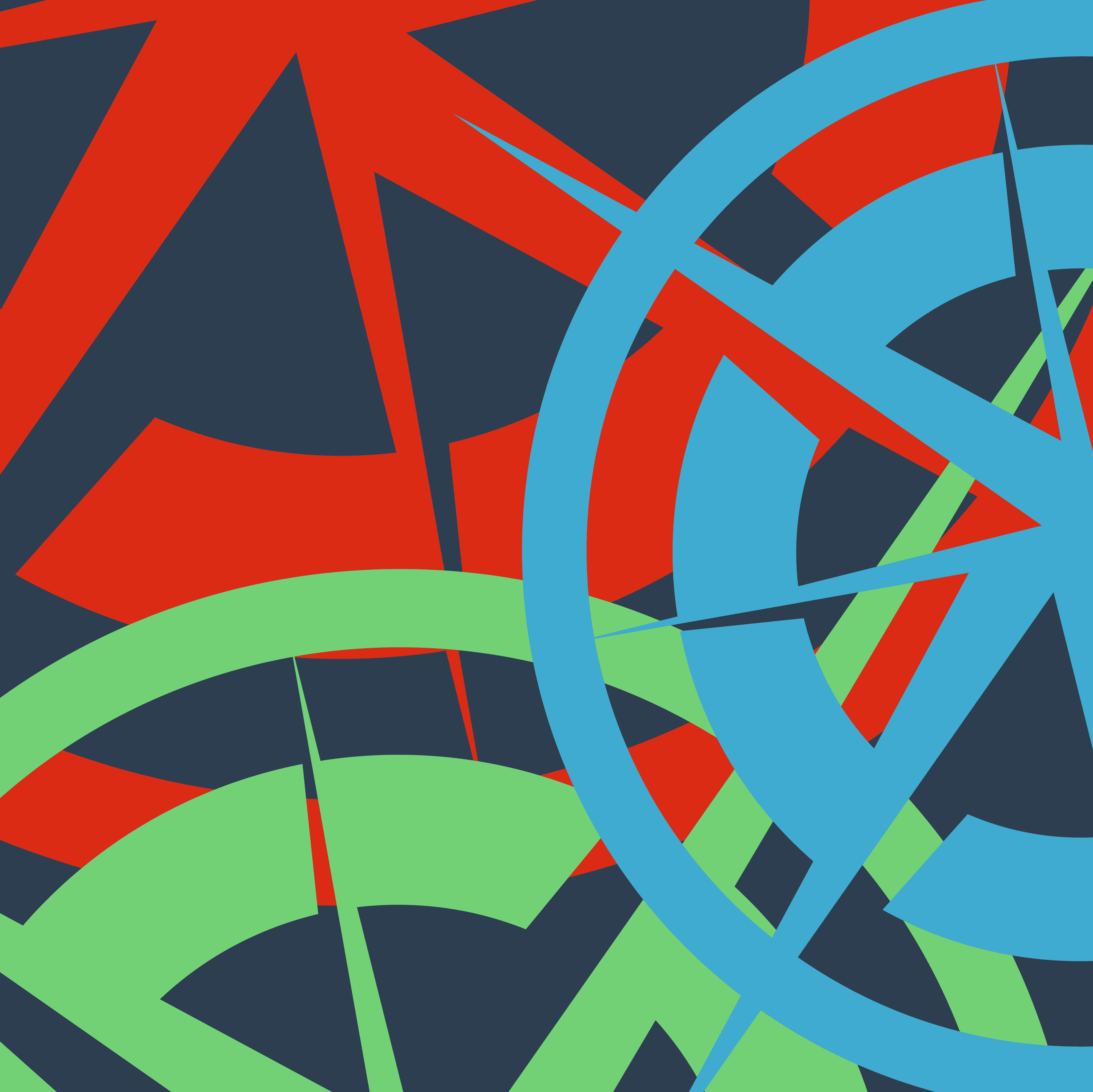
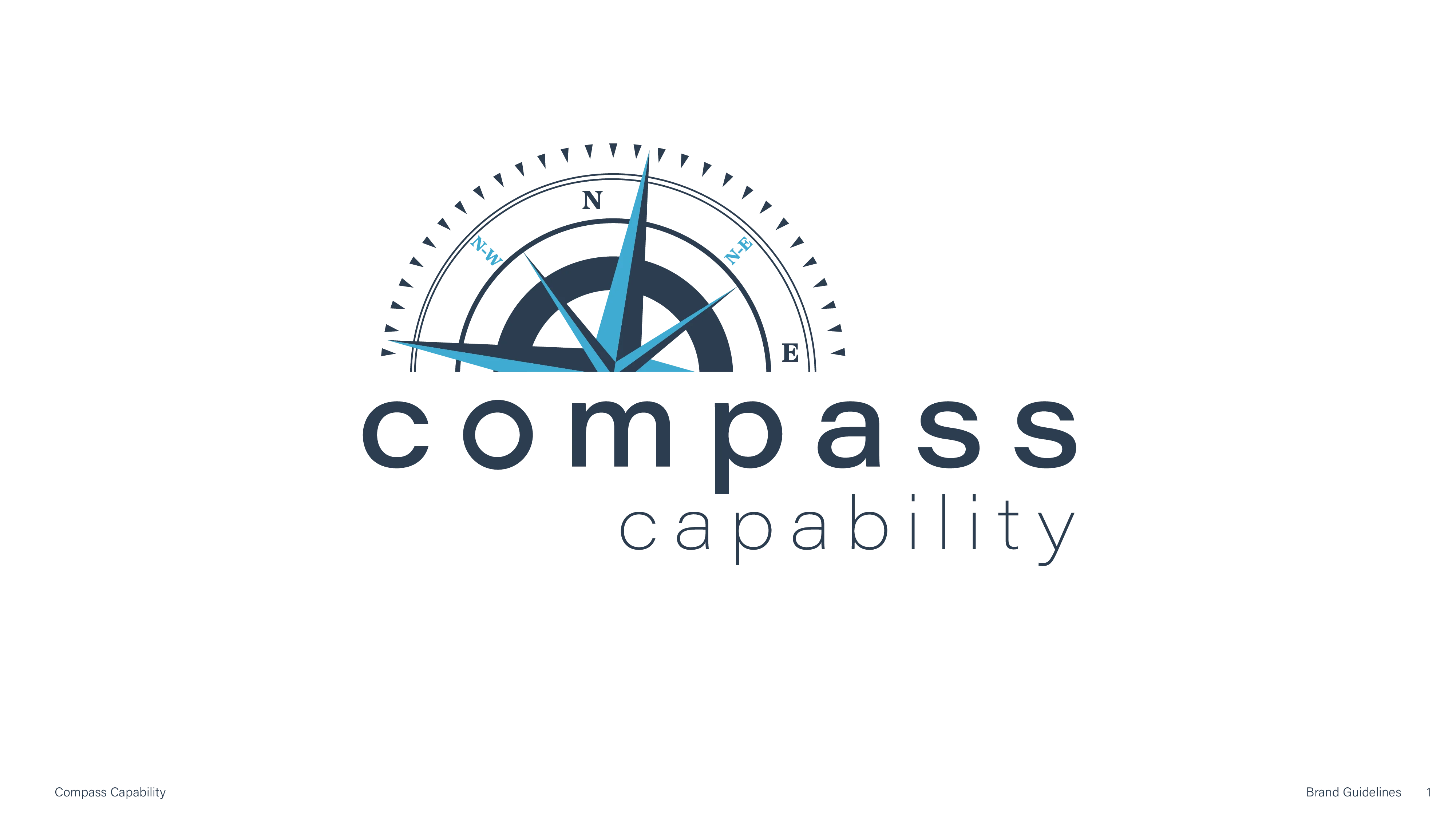
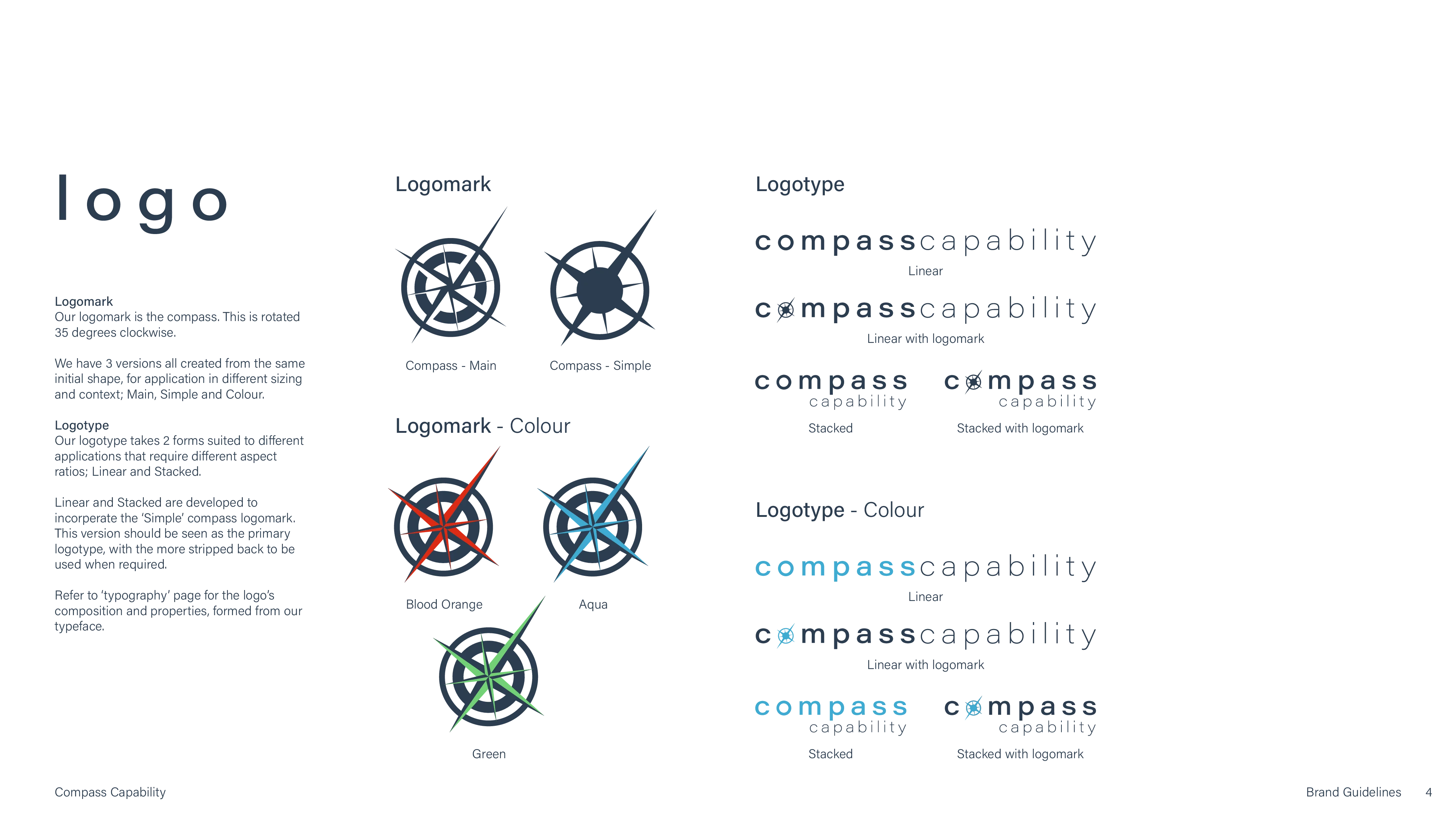
The logo reads as direction. From the mark came a flexible graphic motif and a repeating pattern, both built on the same geometry so the brand holds together wherever it lands.
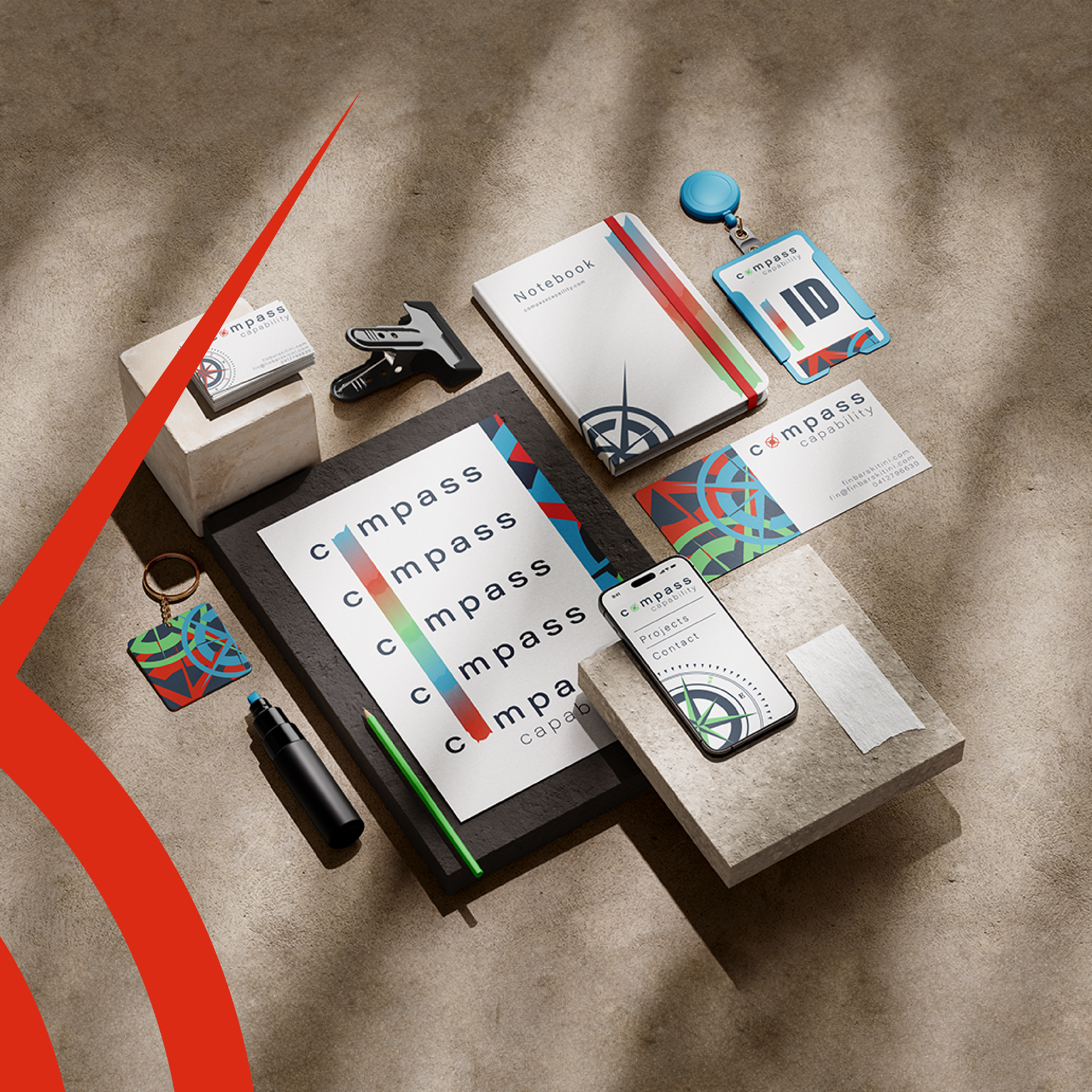
Applied
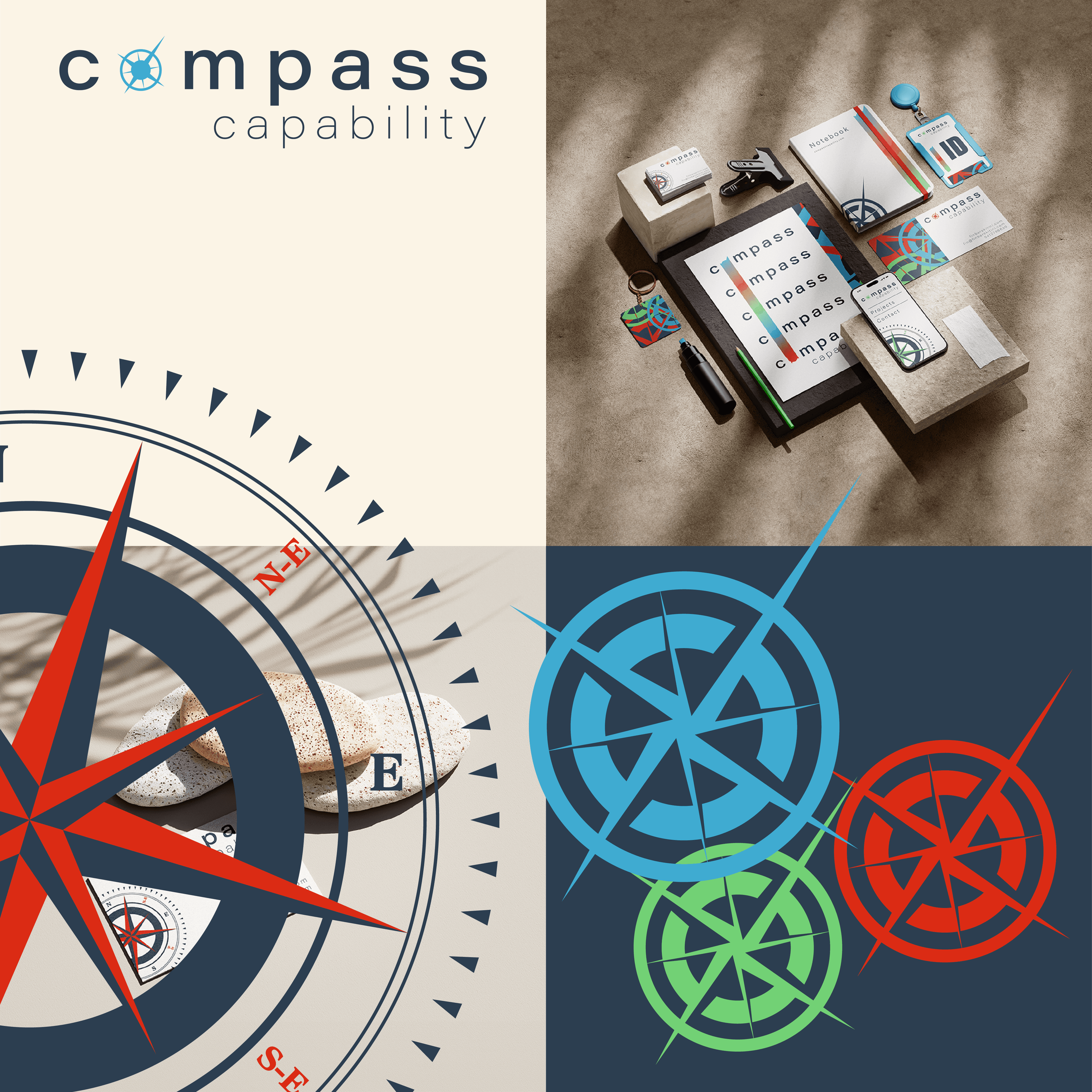
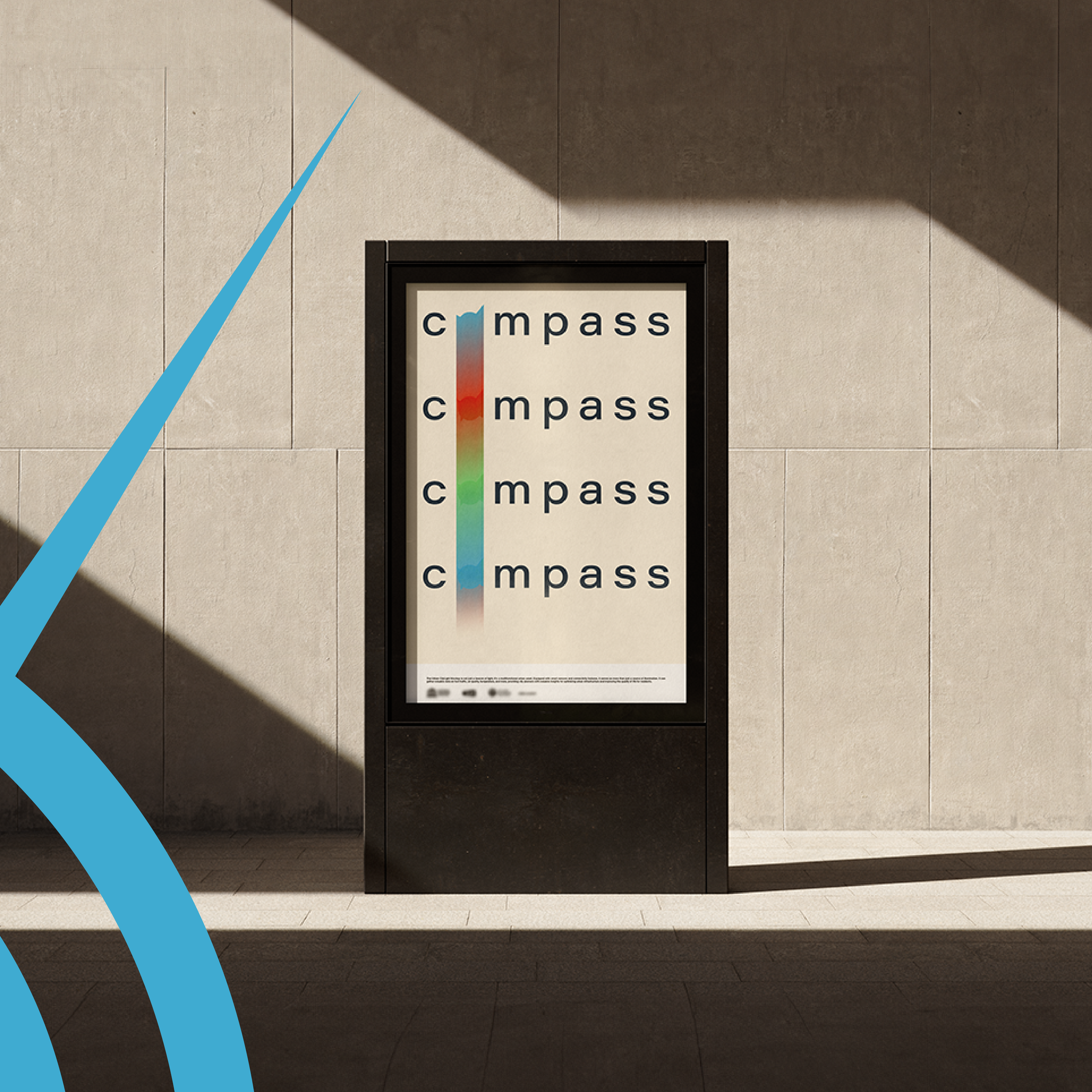
The same system, run across outdoor, print and stationery. It had to stay credible at billboard scale and at the size of a business card.

Brand Guidelines
ROLE
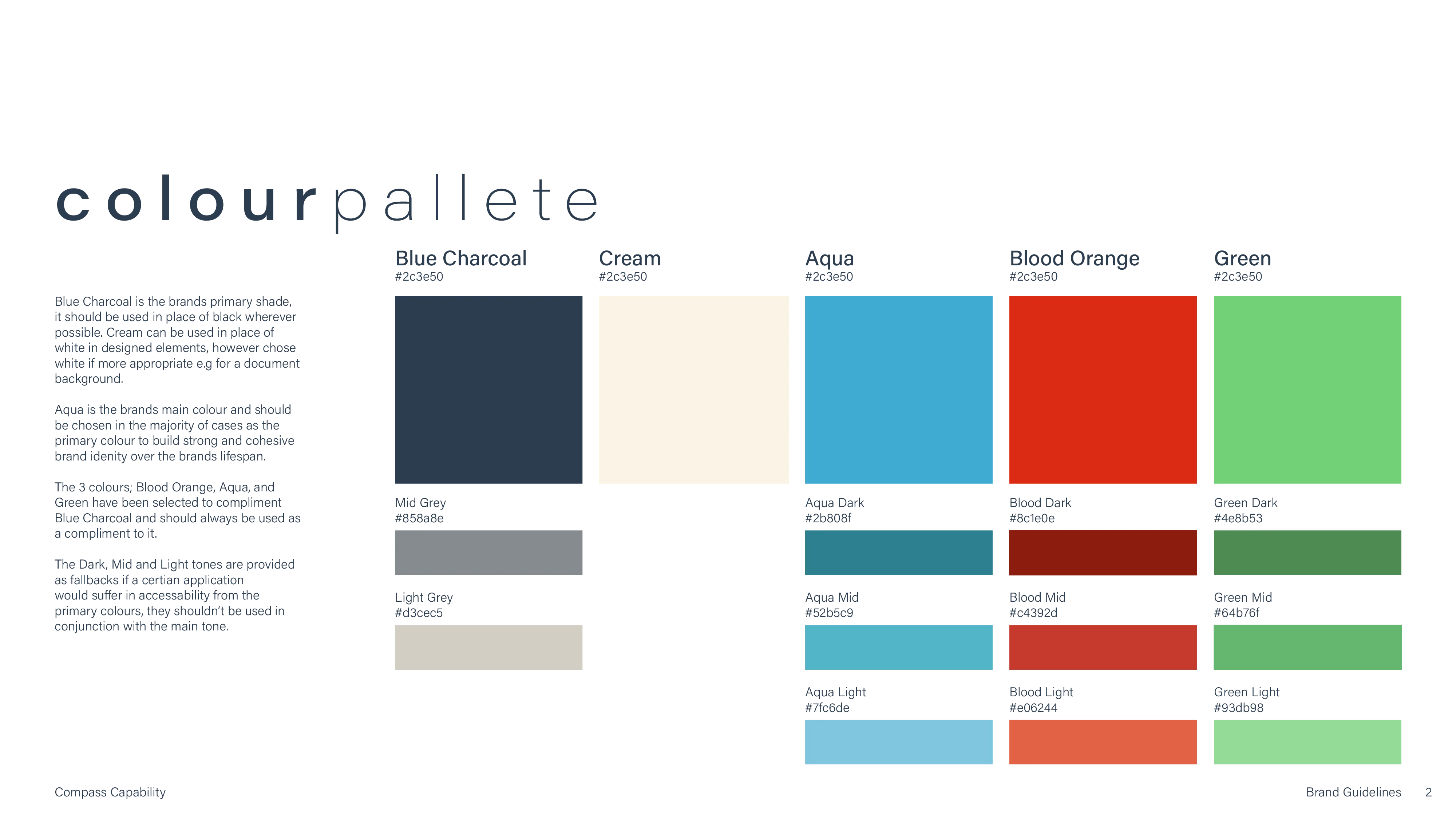
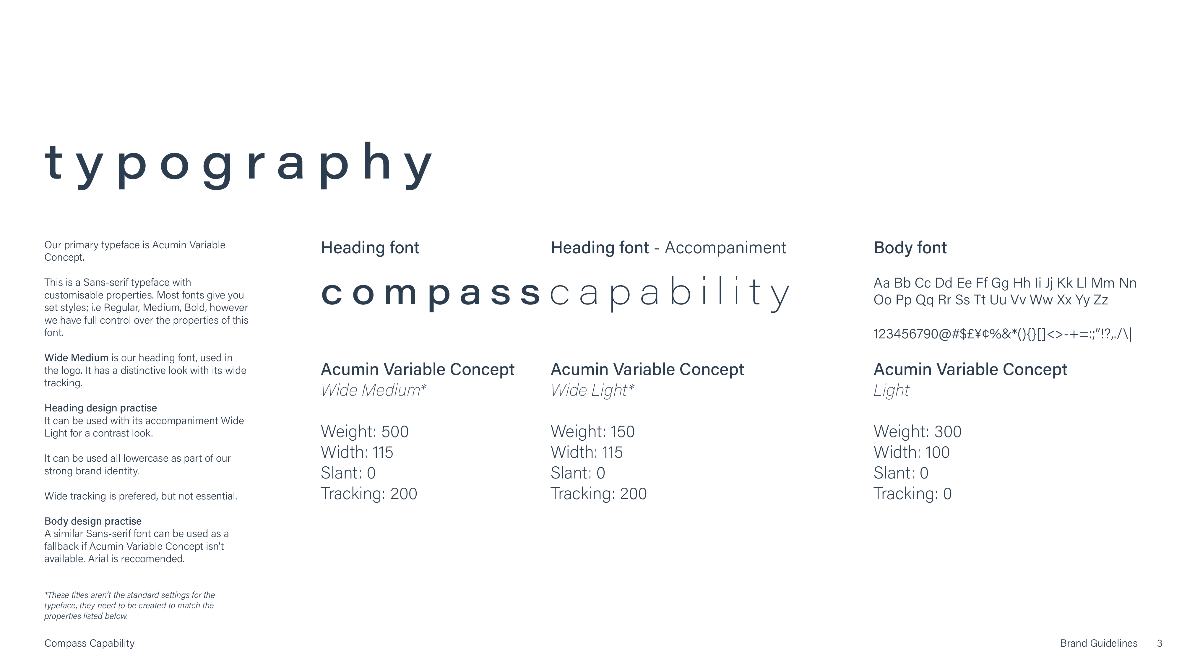
Sole designer. Built the full identity: logo with directional symbolism, typography, logo variations, graphic asset systems, brand guidelines and social assets.
PROBLEM
Compass needed an identity that read as navigation, direction and capability across green industry, renewables, mining, transport and manufacturing. It had to feel credible at every touchpoint and not lean too hard on any one sector.
OUTCOME
Consistent visual language delivered across the brand system.
SKILLS
OPEN FOR WORK
finbar@finbar.studio