Norths Devils RLFC
A modernised mark
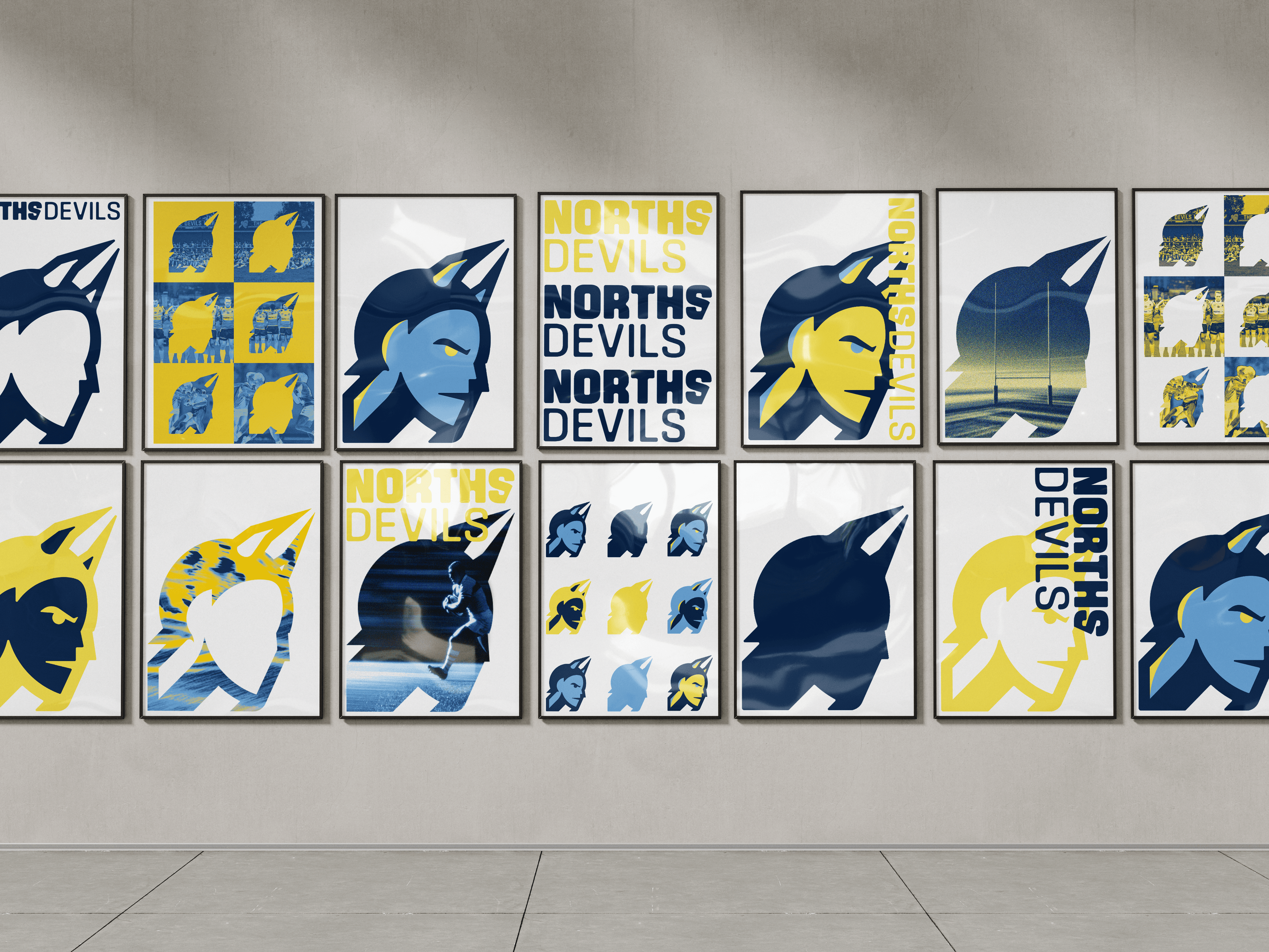
The brief was to feel current without losing the club. I kept the devil and tightened the vector construction so it holds at small sizes and in digital, where the old mark struggled. Angular type for aggression, rounded corners for a bit of vintage.
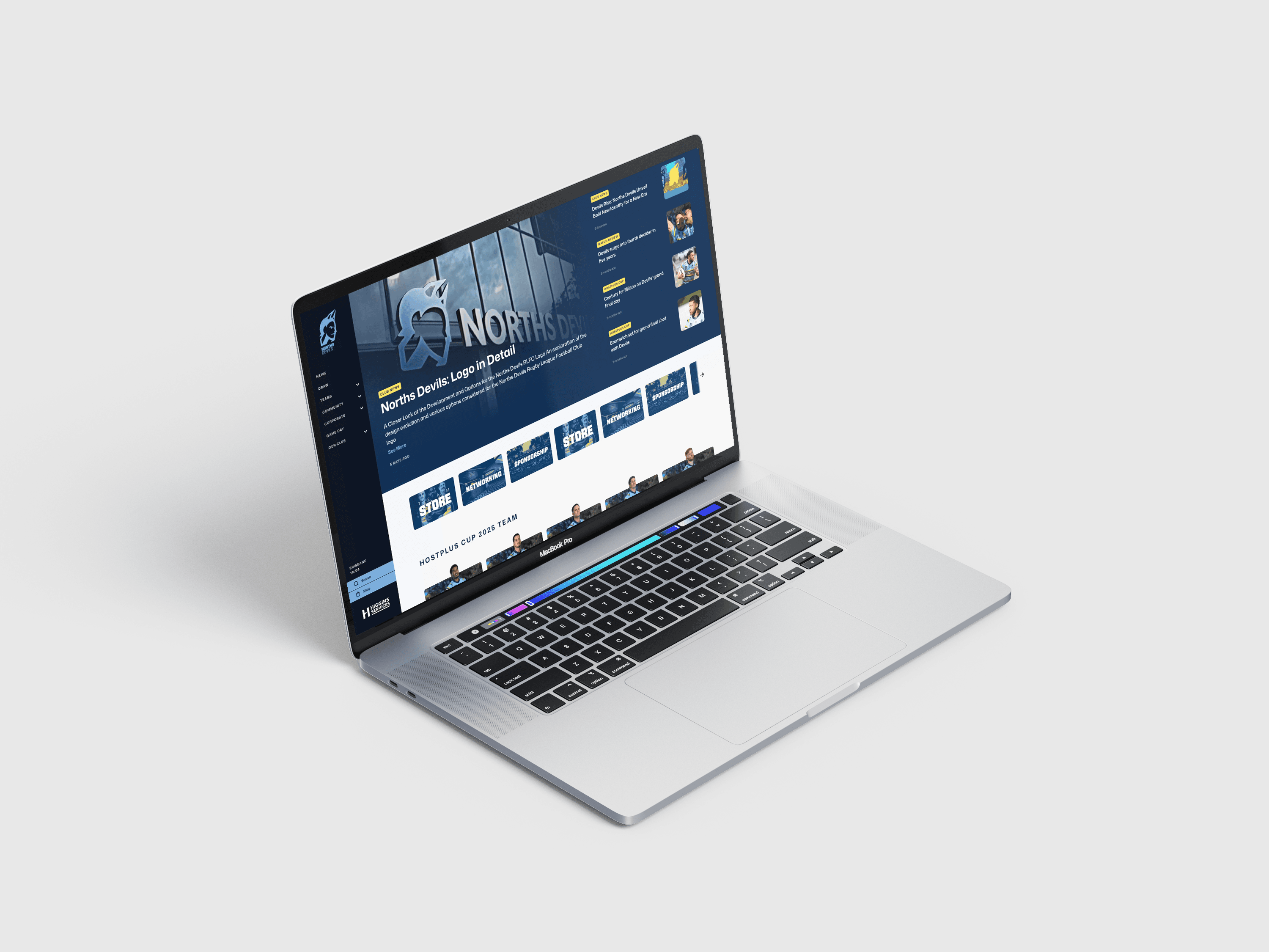
The prototype site
Built from scratch and modelled on professional NRL club sites, so the brand could be judged in something close to the real thing rather than a static mockup.
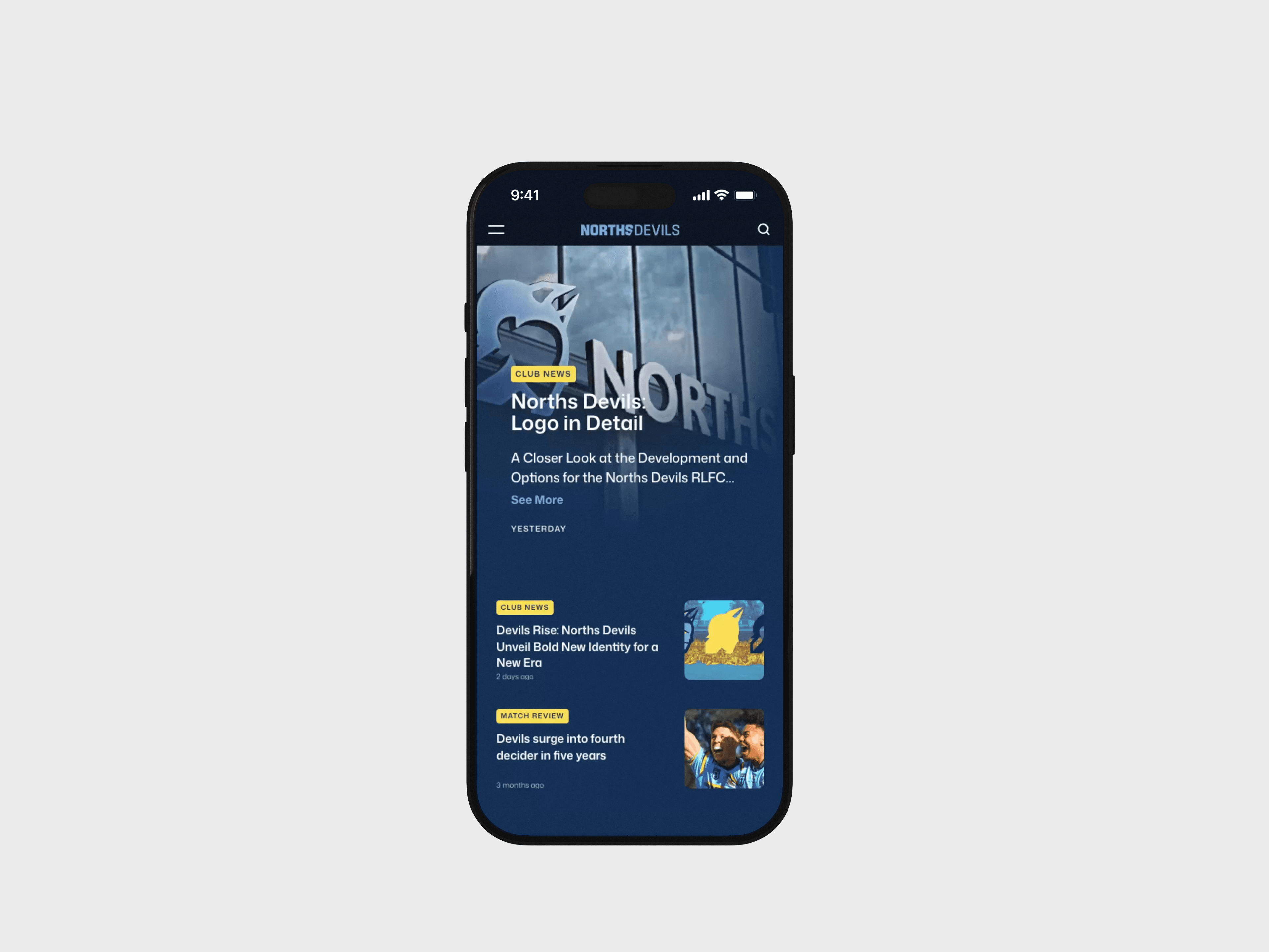
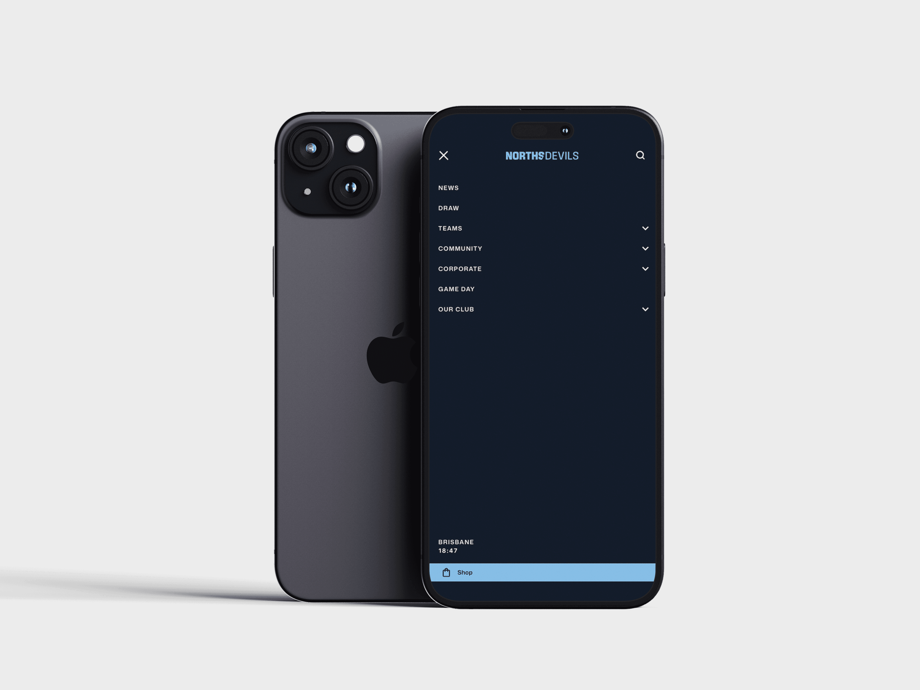
On every screen
The same layout, holding its shape down to a phone.
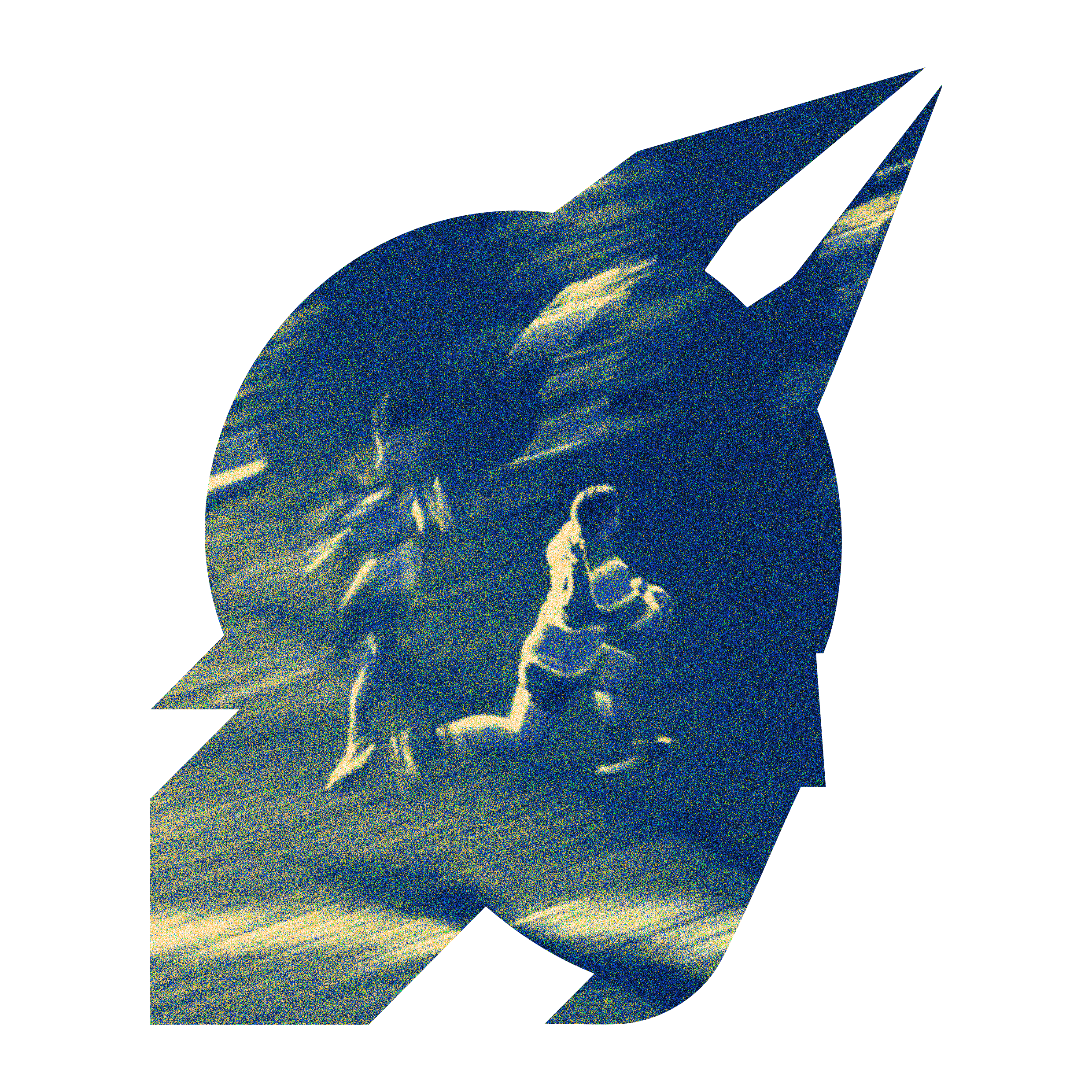
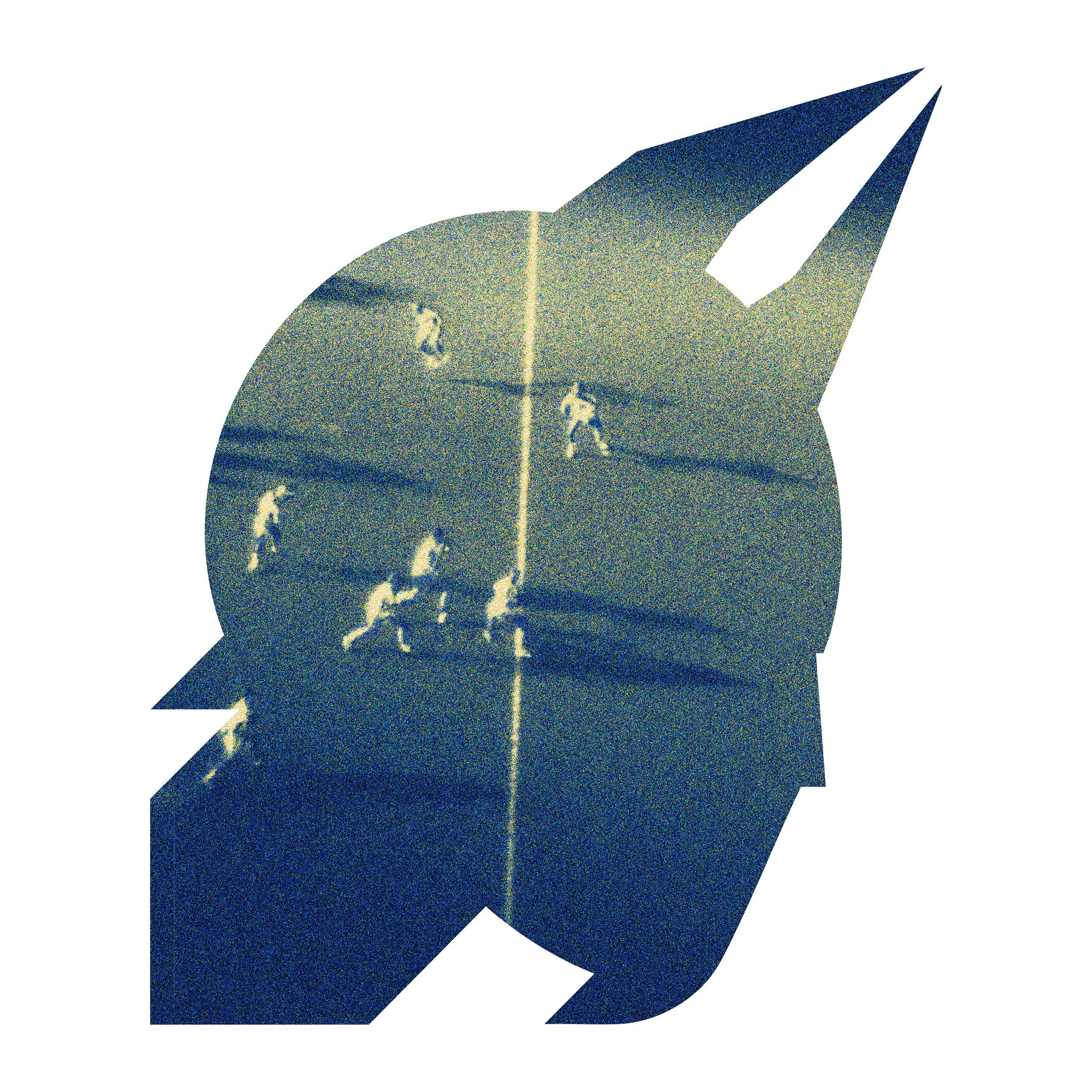
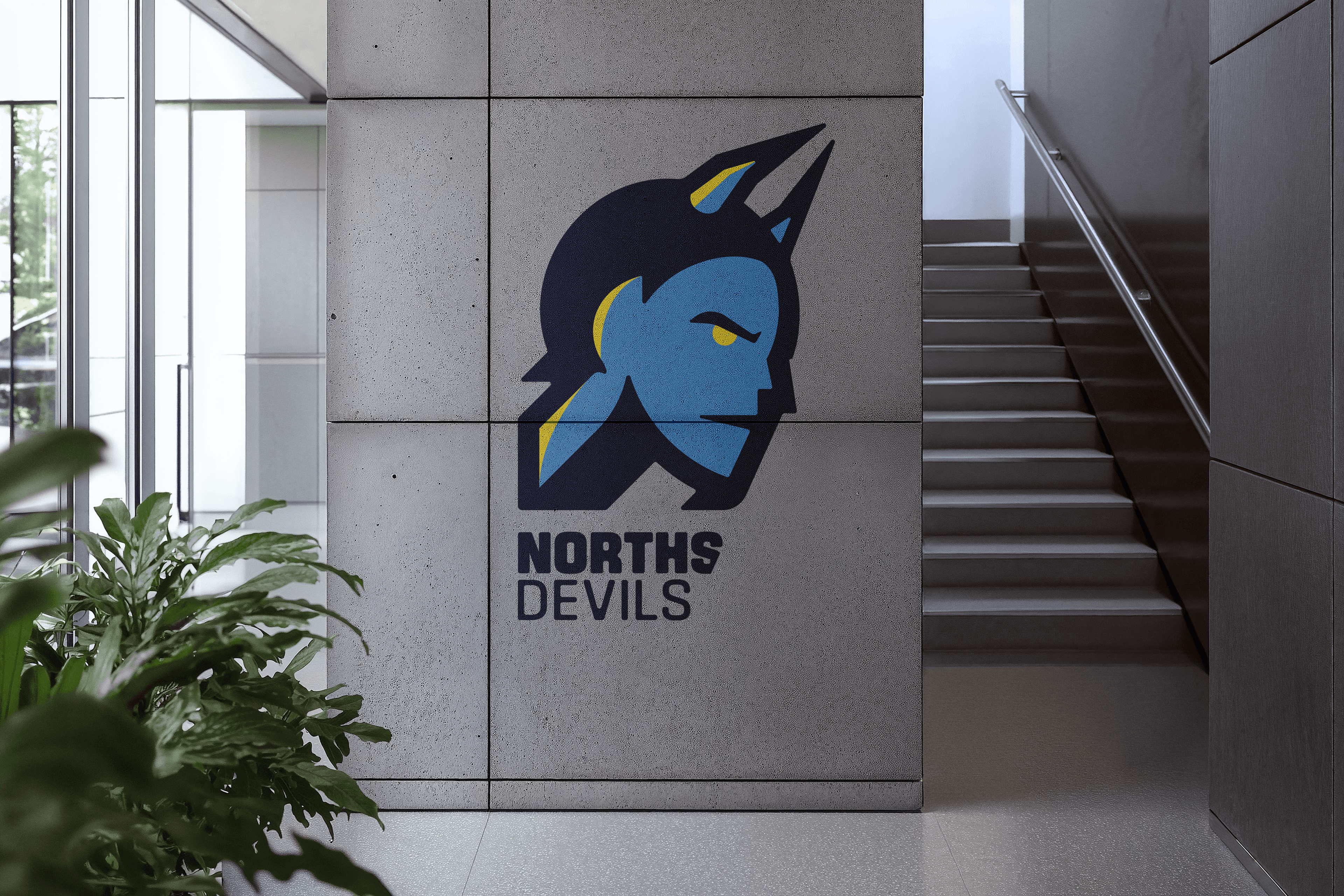
Out in the world
And how the refreshed mark would carry into the club's physical spaces.
ROLE
Sole designer and developer. Refreshed the brand (modernised primary mark, kept the devil) and built a prototype website from scratch modelled on professional NRL club sites.
PROBLEM
Norths Devils needed an identity that felt current and dynamic without losing the club's history. The existing mark struggled at small sizes and in digital. The site concept was built alongside the brand to show how it would work in practice.
OUTCOME
Speculative work. Not adopted by the club. Built as a self-initiated concept.
SKILLS
LIVE SITE
OPEN FOR WORK
finbar@finbar.studio