Copper Company
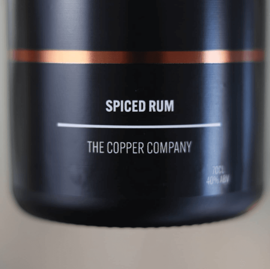
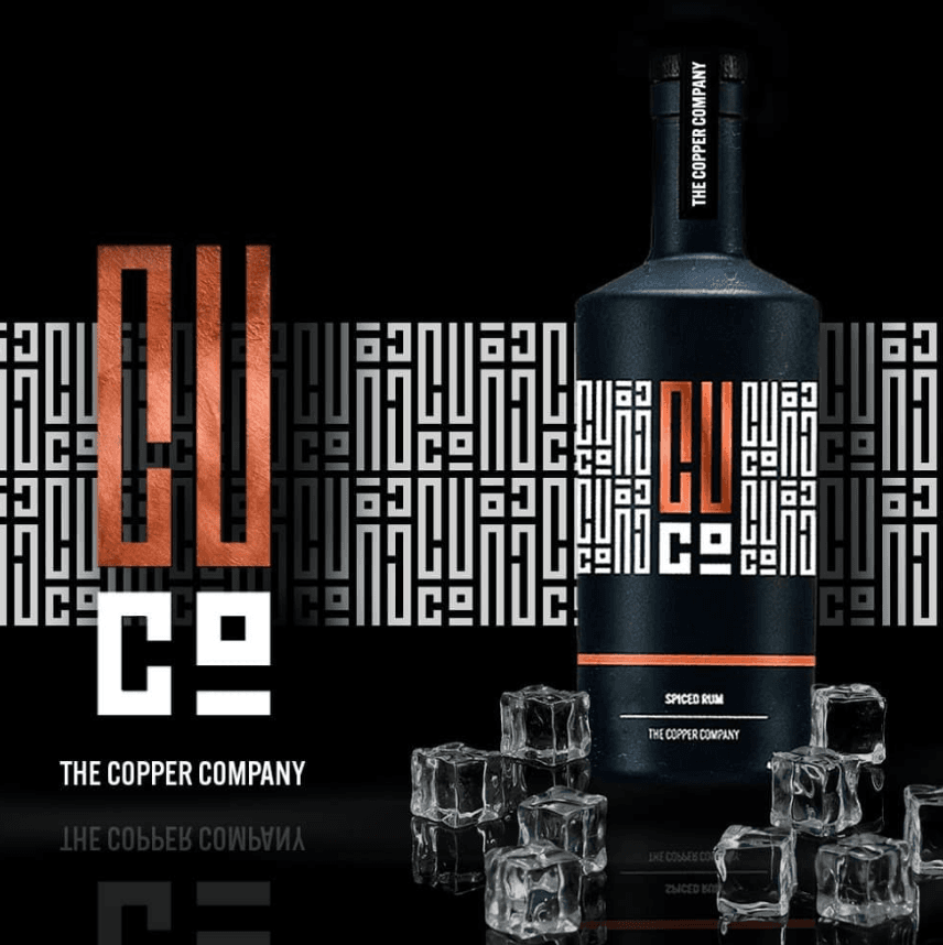
On the bottle
The monogram does the heavy lifting on pack. The front label keeps it to the mark and the name; the back carries tasting notes over the repeating pattern, built from the same geometry as the logo.
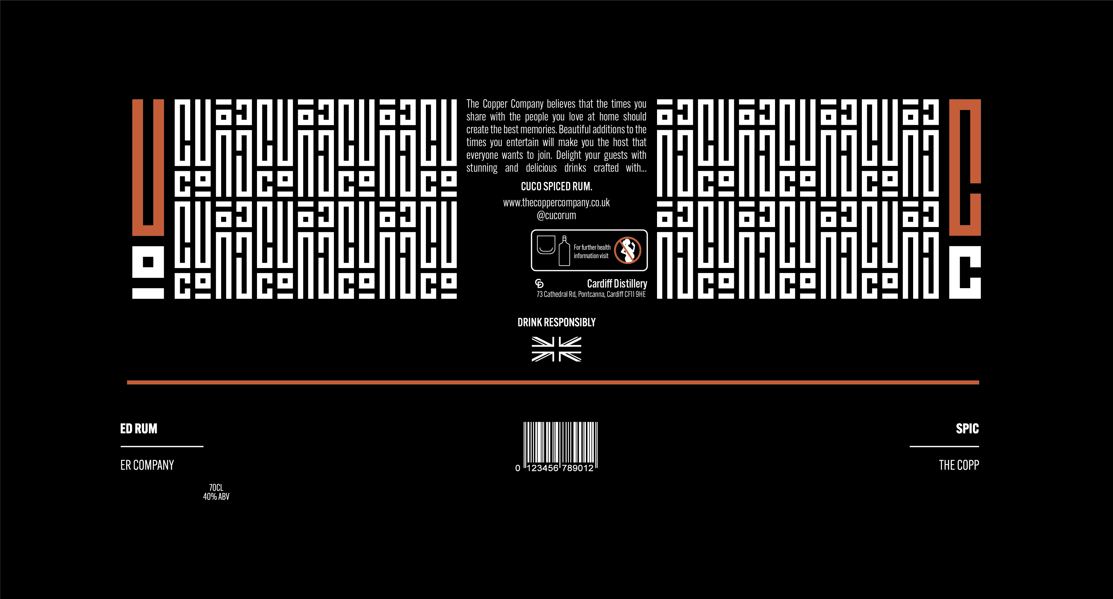
Print-ready artwork
The label as a flat net, set up for production with bleed and crop marks so it could go straight to the printer.
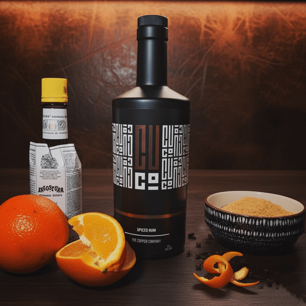
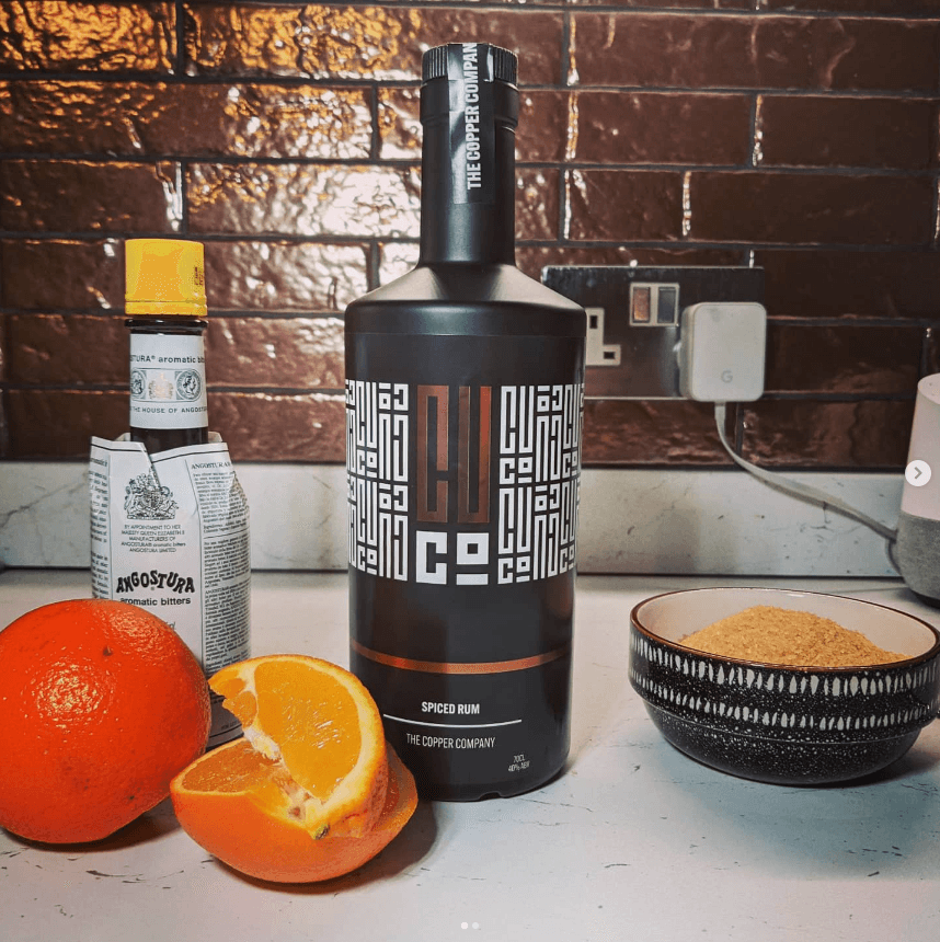
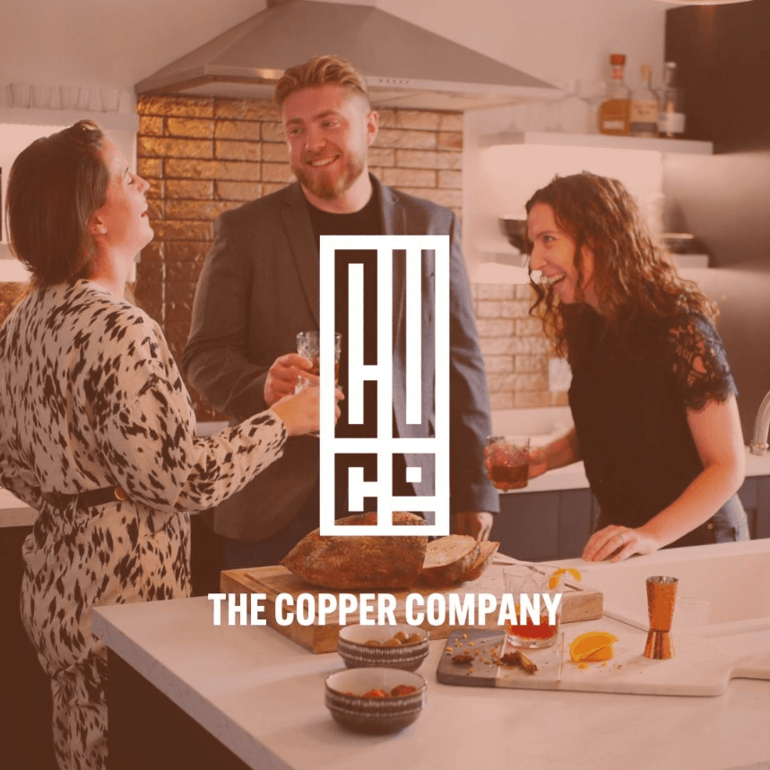
On social
A short run of launch photography, graded to the copper-and-dark palette so the feed reads as one piece with the pack.
ROLE
Sole designer. Built the full brand: monogram logo, repeating pattern for packaging and brand applications, guidelines, print-spec packaging and social photography.
PROBLEM
The Copper Company was being built from scratch: name, identity and packaging all needed to line up. The mark had to stand out on shelf and translate into a pattern that could wrap across packaging and brand touchpoints.
OUTCOME
Client happy with the final output and the brand reading consistently across every touchpoint.
SKILLS
OPEN FOR WORK
finbar@finbar.studio