Nimbus Coffee Co.
The mark and palette
A cloud-formation mark with an earthy palette that nods to roasting terrain. The logotype is set to sit calmly beside it, warm rather than precious.

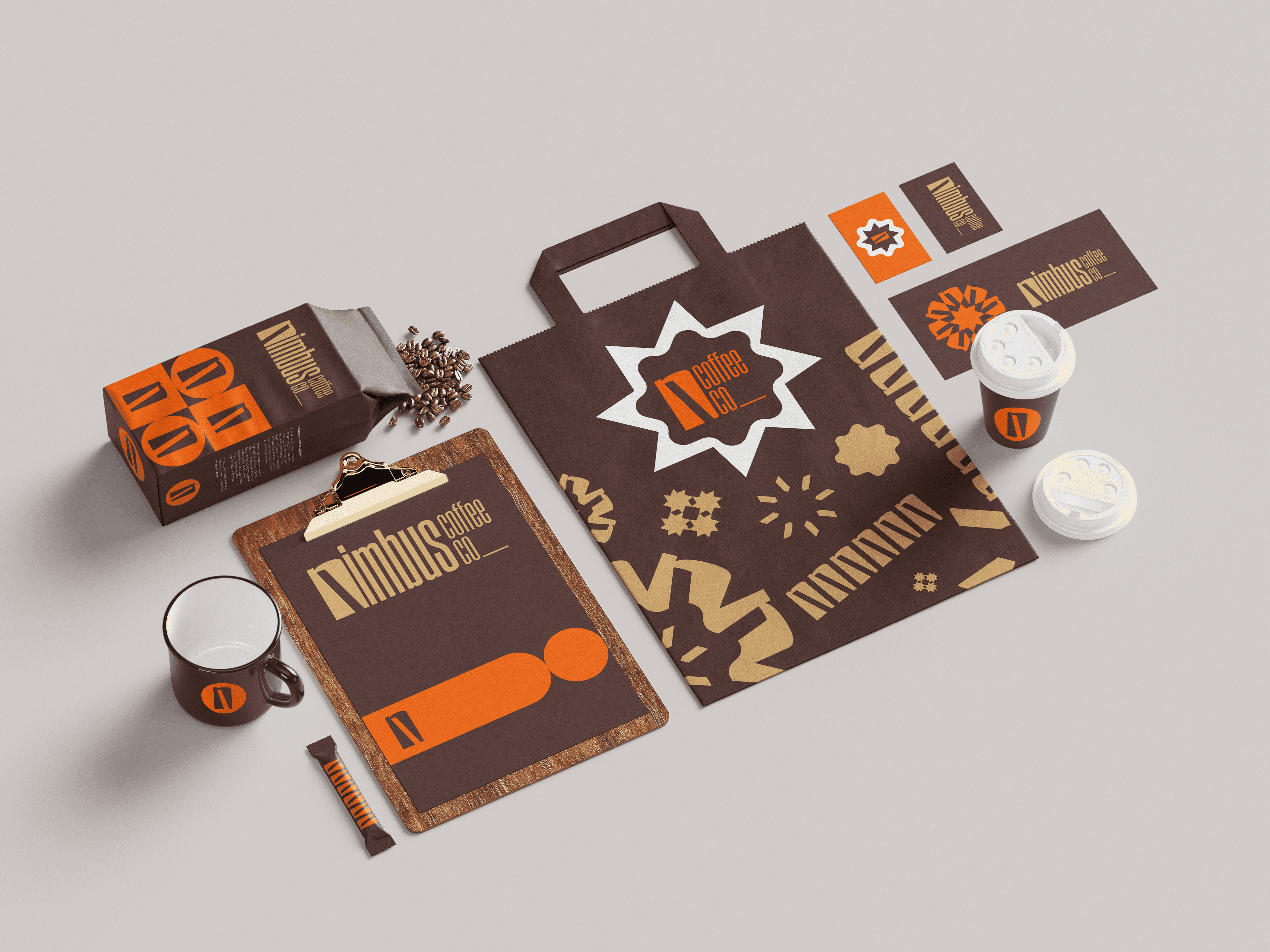
Packaging
A modular label that scales across bag sizes and blend types, so a new release is a quick change rather than a redesign.
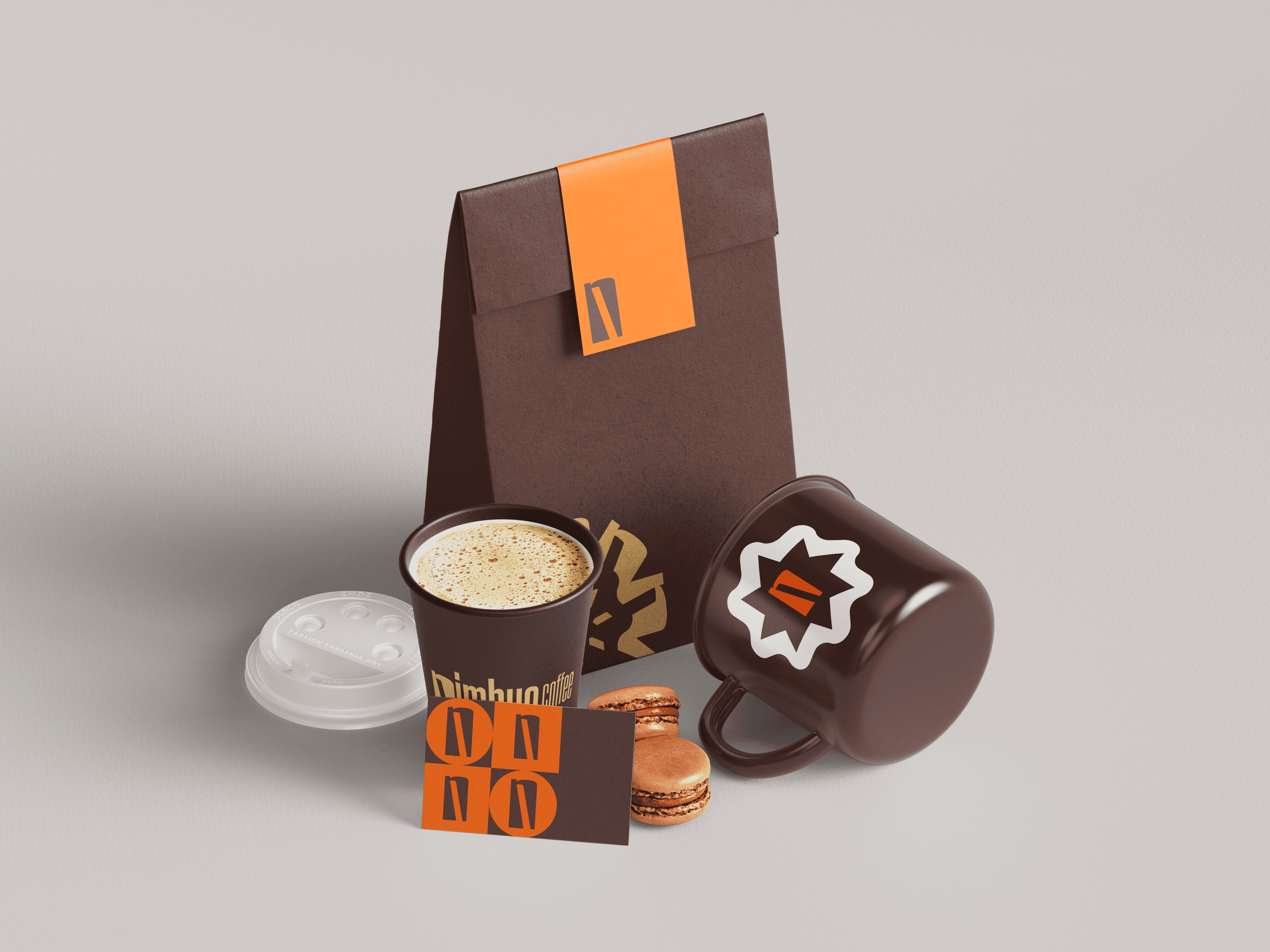
In use
The type hierarchy carried through to the wider brand creative.
ROLE
Sole designer. Built the core logo, typography, palette and brand system. Applied across business cards, packaging, merchandise and digital.
PROBLEM
Nimbus wanted to feel handmade and warm without tipping into fussy or cold. The identity had to hold its own on specialty retail shelves and scale into online sales, pop-ups and whatever came next.
OUTCOME
Brand system delivered across the initial set of touchpoints.
SKILLS
OPEN FOR WORK
finbar@finbar.studio